VEE - Estimation and auditing tool for water, electricity and gas meters
The global smart meter and utility analytics markets are set for substantial growth, users faced challenges in locating missing data, prompting a proposal for data visualization methods, culminating in a successful prototype and reduced processing time, showcasing the importance of prompt problem-solving and collaboration with the engineering team.
Product info
VEE, Valuation Estimation and Editing, emerges as a pivotal solution. Market valuation data demonstrates the growing importance of accurate billing, with utility companies increasingly investing in technologies to mitigate revenue loss. According to a study by Research Nester, the global utility analytics market is forecasted to surpass $6.4 billion by 2027. VEE's ability to analyze customers' historical usage data significantly enhances billing precision, addressing a critical pain point in the industry.
In essence, Sensus Analytics, through innovative solutions like VEE, not only meets market demands but also drives the evolution of utility management, ensuring both operational efficiency and customer satisfaction.
Role
UX Designer
Interaction design / Visual design / Prototyping / Usability testing
Project info and background
Difficulty in efficiently identifying missing data points and their estimates within VEE's initial conceptual design leads to prolonged user task completion times and reliance on a paginated data table.
Sensus Analytics embarked on designing their VEE with an initial conceptual framework from their in-house designers. However, during usability testing, significant hurdles emerged.
Users struggled to efficiently identify missing data points, leading to prolonged task completion times. Particularly, when users selected a device to view its details, they relied heavily on a paginated data table to locate missing data. This table presented 24 data points for each hour, spanning from 12:00 AM to 12:00 AM for each date, with estimations provided for any missing data points. Yet, despite this layout, users found it challenging to discern missing data points and their estimates from the accompanying graph and table. Consequently, the primary focus of the project became enhancing the user experience by simplifying the identification of missing data points and their estimates, addressing the core flaw in the design.
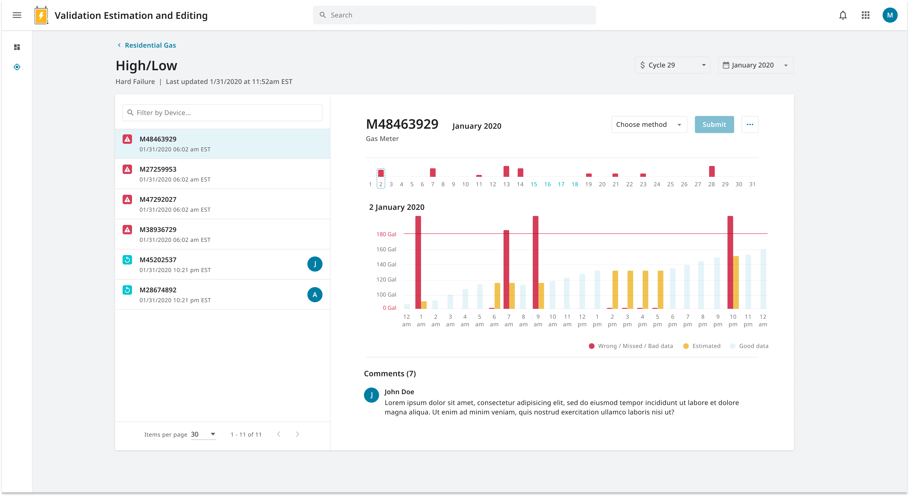
A bar graph emerged as the most promising solution. It allowed for the simultaneous presentation of missing data points and their estimates. Beyond mere presentation, I envisioned incorporating interactive elements into the graph, enabling users to manually override estimates. Collaborating closely with development engineers, we tackled the technical challenge of implementing custom interactions within the graph, swiftly producing a prototype that impressed stakeholders. 
Solution design
The initial design encountered a challenge wherein users spent more time than anticipated locating missing data points and their estimations within a billing cycle of approximately 30 days. The focus shifted towards conveying this information swiftly.Data Visualisation
Proposal to utilize data visualization methods recognized the brain's faster processing of images.
Recognizing the efficiency of visual data processing, I explored data visualization methods to represent the information graphically. Utilizing a bar graph seemed optimal, presenting missing data points and their estimations within a single visual. I proposed incorporating interactive elements to allow users to manually adjust estimates, a feat requiring collaboration with developers. Together, we swiftly developed a prototype that impressed stakeholders, showcasing its efficacy in addressing the problem.
Design Exploration
Design
Collaboration with development engineers swiftly produced prototype impressing stakeholders.

Design Validation
Usability test via video conferencing resulted in positive user response, with significant reduction in processing time.
In a usability test conducted remotely via video conferencing, users were provided with the prototype to navigate while their sessions were recorded. Despite the physical distance, users responded positively to the new interface, swiftly identifying missing data points and estimates within seconds. This marked reduction in processing time garnered praise from users.
Key take aways
- Swift project completion within one month underscored the advantage of promptly identifying and addressing the problem.
- Close collaboration with the engineering team facilitated iterative exploration, leveraging technological possibilities.
- The project highlighted the versatility of data visualization beyond graphical representations alone, emphasizing its role in enhancing user comprehension.
- Working closely with engineers offered opportunities to iterate on ideas and explore new technological possibilities.


